Economic Monitor
Track Economic Health and Trends in Greater Phoenix, Arizona, and the U.S.
GPEC’s Economic Monitor brings together 22 key economic indicators — spanning jobs, housing, inflation, spending, production and more — to provide timely insight into the Greater Phoenix, Arizona, and U.S. economies. It displays current figures alongside historical trends and updates daily as new data are released, helping residents, business leaders, and policymakers track changes locally and nationally. Hover over table cells for details or click a cell to update the charts below.
View the full Economic Monitor
Economic Indicator Source Index
Leading Indicators
- New Housing Permits —
- United States — U.S. Census Bureau and U.S. Department of Housing and Urban Development, New Residential Construction. FRED, Federal Reserve Bank of St. Louis, New Privately-Owned Housing Units Authorized in Permit-Issuing Places: Total Units [PERMIT].
- Arizona — U.S. Census Bureau, Building Permits Survey (BPS). FRED, Federal Reserve Bank of St. Louis, New Private Housing Units Authorized by Building Permits for Arizona [AZBPPRIVSA].
- Greater Phoenix — U.S. Census Bureau, Building Permits Survey (BPS). FRED, Federal Reserve Bank of St. Louis, New Private Housing Structures Authorized by Building Permits for Phoenix-Mesa-Chandler, AZ (MSA) [PHOE004BPPRIVSA].
- Initial Jobless Claims —
- United States — U.S. Employment and Training Administration, Unemployment Insurance Weekly Claims Report. FRED, Federal Reserve Bank of St. Louis, 4-Week Moving Average of Initial Claims [IC4WSA].
- Arizona — U.S. Employment and Training Administration, State Unemployment Insurance Weekly Claims Report. FRED, Federal Reserve Bank of St. Louis, Initial Claims in Arizona [AZICLAIMS].
- Consumer Expectations Index —
- Core Capital Goods Orders —
- Corporate Credit Spread —
- Yield Curve Spread —
Coincident Indicators
- Employment (Nonfarm Payrolls) —
- United States — U.S. Bureau of Labor Statistics, Current Employment Statistics (Establishment Survey) – All Employees, Total Nonfarm.
- Arizona — U.S. Bureau of Labor Statistics, Current Employment Statistics (State and Metro Area) – All Employees, Total Nonfarm in Arizona.
- Greater Phoenix — U.S. Bureau of Labor Statistics, Current Employment Statistics (State and Metro Area) – All Employees, Total Nonfarm in Phoenix-Mesa-Chandler, AZ MSA.
- GDP (Real) —
- Personal Income (Real) —
- Consumer Spending (Real) —
- Manufacturing & Trade Sales (Real) —
- Industrial Production Index —
Lagging Indicators
- Unemployment Rate —
- United States — U.S. Bureau of Labor Statistics, Current Population Survey – Unemployment Rate.
- Arizona — U.S. Bureau of Labor Statistics, Local Area Unemployment Statistics (LAUS) – Unemployment Rate in Arizona.
- Greater Phoenix — U.S. Bureau of Labor Statistics, Local Area Unemployment Statistics (LAUS) – Unemployment Rate in Phoenix-Mesa-Chandler, AZ MSA.
- Inflation Rate —
- House Price Index —
- United States — Federal Housing Finance Agency, FHFA House Price Index.
- Arizona — Federal Housing Finance Agency, FHFA House Price Index.
- Greater Phoenix — Federal Housing Finance Agency, FHFA House Price Index.
- Household Debt —
- United States — Federal Reserve Bank of New York, Household Debt and Credit Report.
- Bank Loan Delinquency Rate —
- Business Inventory-to-Sales Ratio —
Other Indicators
- S&P 500 ETF (SPY) —
- United States — State Street Global Advisors, SPDR S&P 500 ETF Trust (SPY). Yahoo Finance.
- Federal Funds Rate —
- Trade Balance (Goods) —
- Broad Dollar Index (Real) —
Frequently Asked Questions
What is the Economic Monitor?
The Economic Monitor is a free, public-facing economic intelligence tool created by the Greater Phoenix Economic Council (GPEC). It brings together 22 key economic indicators spanning jobs, housing, inflation, spending, production, and more to provide timely insight into the Greater Phoenix, Arizona, and U.S. economies. The tool features an interactive data table, historical charts, and an AI-generated summary, all updated daily as new government data are released.
Who is the Economic Monitor for?
The Economic Monitor is designed for anyone interested in understanding the economy, including residents, business leaders, policymakers, journalists, educators, and researchers. It requires no expertise, login, or subscription.
Where does the data come from?
All data comes from authoritative public sources, including the U.S. Bureau of Labor Statistics (BLS), the Bureau of Economic Analysis (BEA), the Federal Reserve, the U.S. Census Bureau, the Federal Housing Finance Agency (FHFA), the Federal Reserve Bank of New York, and the University of Michigan. Each series is documented in the Source Index below with a direct link to its original public dataset.
How often is the data updated?
The Economic Monitor checks for new data every day. As government agencies release new figures, whether weekly, monthly, quarterly, or annually, the tool automatically retrieves and displays the latest values. The “Last Retrieved” date shown in each cell’s tooltip confirms when the data was last checked.
What do leading, coincident, and lagging indicators mean?
Leading indicators tend to change before the overall economy shifts, helping anticipate future activity (e.g., housing permits, consumer expectations). Coincident indicators move in line with current conditions, reflecting real-time economic health (e.g., employment, GDP). Lagging indicators change after the economy has already shifted, confirming trends already underway (e.g., unemployment rate, inflation). A fourth group, “Other,” includes indicators that don’t fit neatly into these categories but still provide valuable economic context.
What do the colored arrows in the table mean?
Arrows indicate whether a value has increased or decreased compared to the prior period or prior year. The color reflects whether that direction is generally considered positive or negative for the economy. For example, a green up arrow on employment signals job growth (positive), while a green down arrow on inflation signals easing price pressure (also positive). Arrow direction and color depend on the specific indicator.
What does hovering over a table cell show?
Hovering displays a tooltip with the indicator’s definition, data source, release frequency, the date of the current value, the comparison-period date, and when the data was last retrieved. This makes the tool self-documenting, so you can understand each data point without leaving the page.
What happens when I click a cell?
Clicking a table cell selects it and loads the corresponding data series into two synchronized charts below the table: Indicator Levels and Indicator Growth. The selected cell highlights, and you can use the date-range buttons (1Y, 2Y, 5Y, 10Y, 25Y, MAX, etc.) to adjust the time horizon. Clicking the same cell again deselects it and clears the charts. You can also click and drag on a chart to zoom into a specific range, then double-click to reset the zoom.
What is the difference between Indicator Levels and Indicator Growth?
Indicator Levels shows the actual value of a series over time (e.g., total jobs or GDP in dollars). Indicator Growth shows the rate of change (e.g., percent change year-over-year). Separating levels from growth rates makes each easier to interpret, since they often operate on very different scales.
Why don’t some indicators appear in the Indicator Growth chart?
Growth rates are omitted for certain indicators where they would not be meaningful or could be misleading. Some indicators, such as the inflation rate and unemployment rate, are already expressed as rates or changes, so computing a growth rate of a rate would add little insight. Others, like credit spreads and the yield curve, can hover near zero or cross it, which would produce extreme or undefined percentage changes. In these cases, the Levels chart tells the full story on its own.
What are the gray shaded areas in the charts?
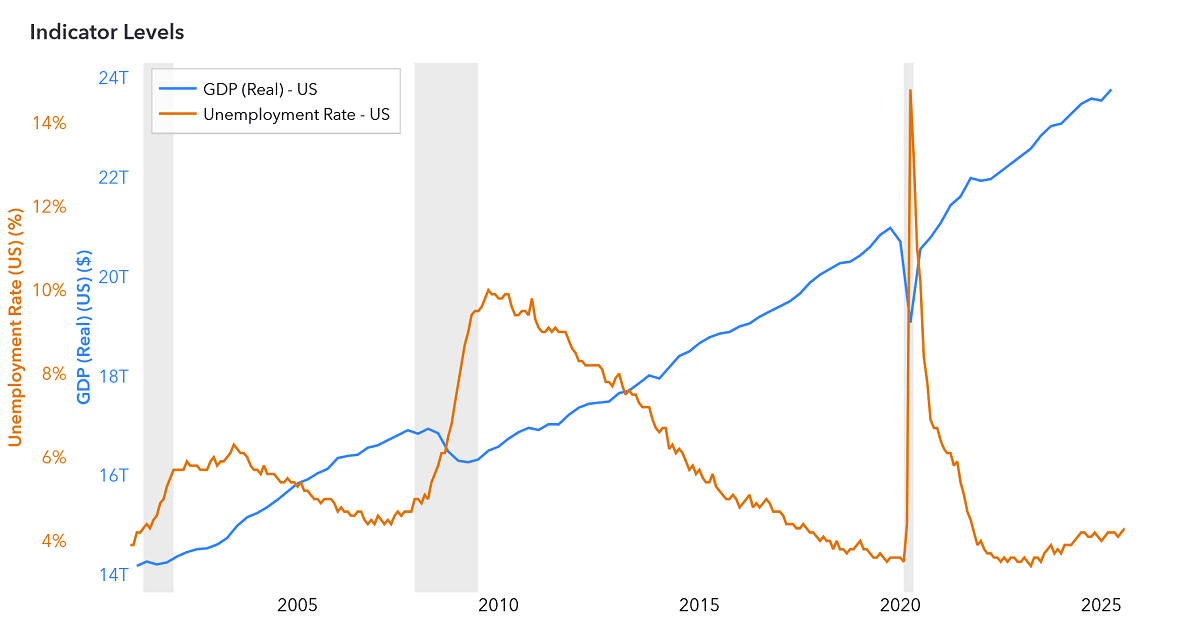
The gray vertical bands in the Indicator Levels and Indicator Growth charts mark U.S. recession periods as determined by the National Bureau of Economic Research (NBER). The NBER’s Business Cycle Dating Committee is the widely accepted authority for identifying when recessions begin and end. Displaying these periods helps you see how each indicator behaved before, during, and after economic downturns, making it easier to put current trends in historical context.
What do the abbreviations in the table mean?
Common abbreviations include: GDP (Gross Domestic Product), CPI (Consumer Price Index), PCE (Personal Consumption Expenditures), HPI (House Price Index), ETF (Exchange-Traded Fund), MSA (Metropolitan Statistical Area), SAAR (Seasonally Adjusted Annual Rate), MoM (Month-over-Month), QoQ (Quarter-over-Quarter), YoY (Year-over-Year), WoW (Week-over-Week), pp (percentage points), bps (basis points), and pts (points). Source abbreviations include FRED (Federal Reserve Economic Data), BEA (Bureau of Economic Analysis), BLS (Bureau of Labor Statistics), and FHFA (Federal Housing Finance Agency).
Why are some table cells empty?
Some indicators are only reported at certain geographic levels. For example, Industrial Production is only available nationally, so the Arizona and Greater Phoenix columns for that row are empty. Similarly, some cells may lack a prior-period change if the data is released annually and a shorter-term comparison does not apply.
What does “seasonally adjusted” mean?
Seasonal adjustment is a statistical method that removes predictable seasonal patterns from data, making it easier to identify underlying trends. For example, retail hiring typically spikes in December; seasonally adjusted data smooths out that expected spike to reveal whether employment is genuinely strengthening or weakening. Data labeled “not seasonally adjusted” reflects raw reported values.
What does “chained dollars” mean?
Chained dollars are a way of adjusting economic values for inflation so they can be compared meaningfully over time. “Chained 2017 dollars” means figures are expressed in terms of 2017 purchasing power, removing the effect of price changes. This lets you see whether something like GDP has actually grown in volume, rather than just because prices rose.
What does “Greater Phoenix” refer to?
In the Economic Monitor, “Greater Phoenix” refers to the Phoenix-Mesa-Chandler, AZ Metropolitan Statistical Area (MSA), which comprises Maricopa County and Pinal County as defined by the U.S. Office of Management and Budget.
What is the AI Summary and how is it generated?
The AI Summary is an expandable section at the top of the tool that provides a plain-language analysis of current economic conditions. Each day, the full dataset is processed by an OpenAI large language model, which generates three sections: the top five U.S. trends, the top five Arizona/Greater Phoenix trends, and a Takeaways section on the broader outlook. Every statistic cited in the summary appears in the table below, so users can verify the analysis directly.
What is the Source Index?
The Source Index is the collapsible reference section below the table that documents all 36 data series used in the Economic Monitor. Each entry lists the indicator name, its definition, the original government source with a direct link to the public dataset, and methodological notes such as seasonal adjustment status and release frequency. It provides full transparency and enables independent verification of the data.
Have other questions or feedback? Reach out to our Research & Analytics team at research@gpec.org.
Want insider insights on the economy? Connect with us at engagement@gpec.org for more details on becoming an investor.
The Economic Monitor offers publicly-available data on economic indicators for the US, Arizona, and Greater Phoenix. It is for general information only and is not a prediction of future market or investment performance, nor a tool for market timing. This content is not legal, tax, financial, or investment advice, and should not be taken as specific recommendations. For guidance on your individual situation, consult a qualified attorney, accountant, or financial professional.